Cpase
Clare’s Space luxury boutique health club.

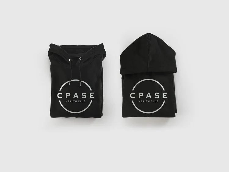
The CPASE logo is simple yet effective. The wide spacing of the lettering reflects the brand name and service, a space to better yourself. A circle surrounds the logotype, but it’s not bound by it, creeping out at either side, serving as a metaphor on a multitude of levels. It conveys how CPASE breaks boundaries, it communicates how you can test your limits, but most importantly, it imparts the freedom you’ll find at CPASE.


The Brand Name ‘CPASE’ is, first and foremost, an abbreviation for Clare’s Space. This is a boutique health club envisioned by Clare and brought to life in the picturesque Cheshire countryside, offering an all-encompassing luxury lifestyle experience for its members that supports fitness, wellness and relaxation amid idiosyncratic interiors and sleek decor.


NEED OUR HELP?
Whether it's Branding, Design, Websites, Photography, Video, Print or Social Media, we can help you make an impact.