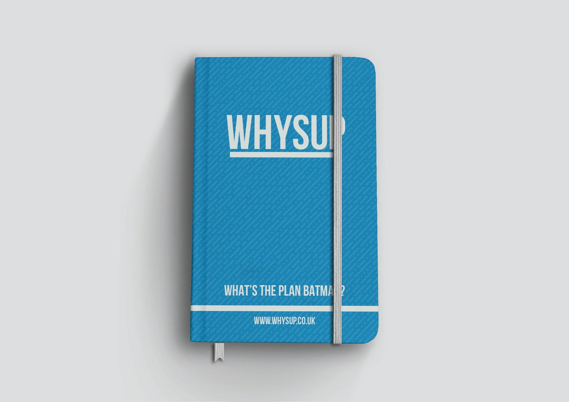
WHYSUP
A mental health and wellness organisation that reduces and resolves the impact of addiction and mental illness on individuals, organisations and communities through a wide range of support.
The WHYSUP logo utilises the bold San serif typeface, giving the logo a modern and contemporary feel, appealing primarily to young adults and forward-thinking professionals. Sitting underneath our font is WHYSUP's foundation, the underlying issues that come with every type of addiction, the platform used to educate and the base used to rebuild people's lives. The underline is slightly thicker than the base of our font, drawing more emphasis while highlighting the topics to be discussed.
Taking the underline from our logo, we created a bespoke WHYSUP brand pattern to use across design and marketing. Using lines of differing widths is a visual representation of people's problems with addiction that WHYSUP deal with. Whether their problem is big or small, everyone gets the same professional, no-nonsense WHYSUP treatment. Rotating the lines to a perfect 45 degrees shows how WHYSUP attacks issues from a different angle, using their past experiences and personal struggles with addiction to help others overcome theirs.
NEED OUR HELP?
Whether it's Branding, Design, Websites, Photography, Video, Print or Social Media, we can help you make an impact.


