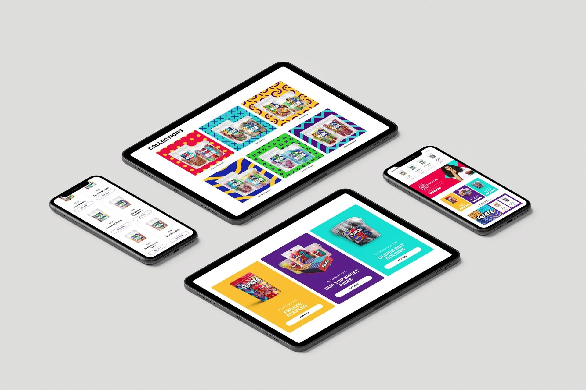
Freaze
Making the world a happier, more joy-filled place, one freeze-dried sweet at a time. Go big, go bold, go bonkers!

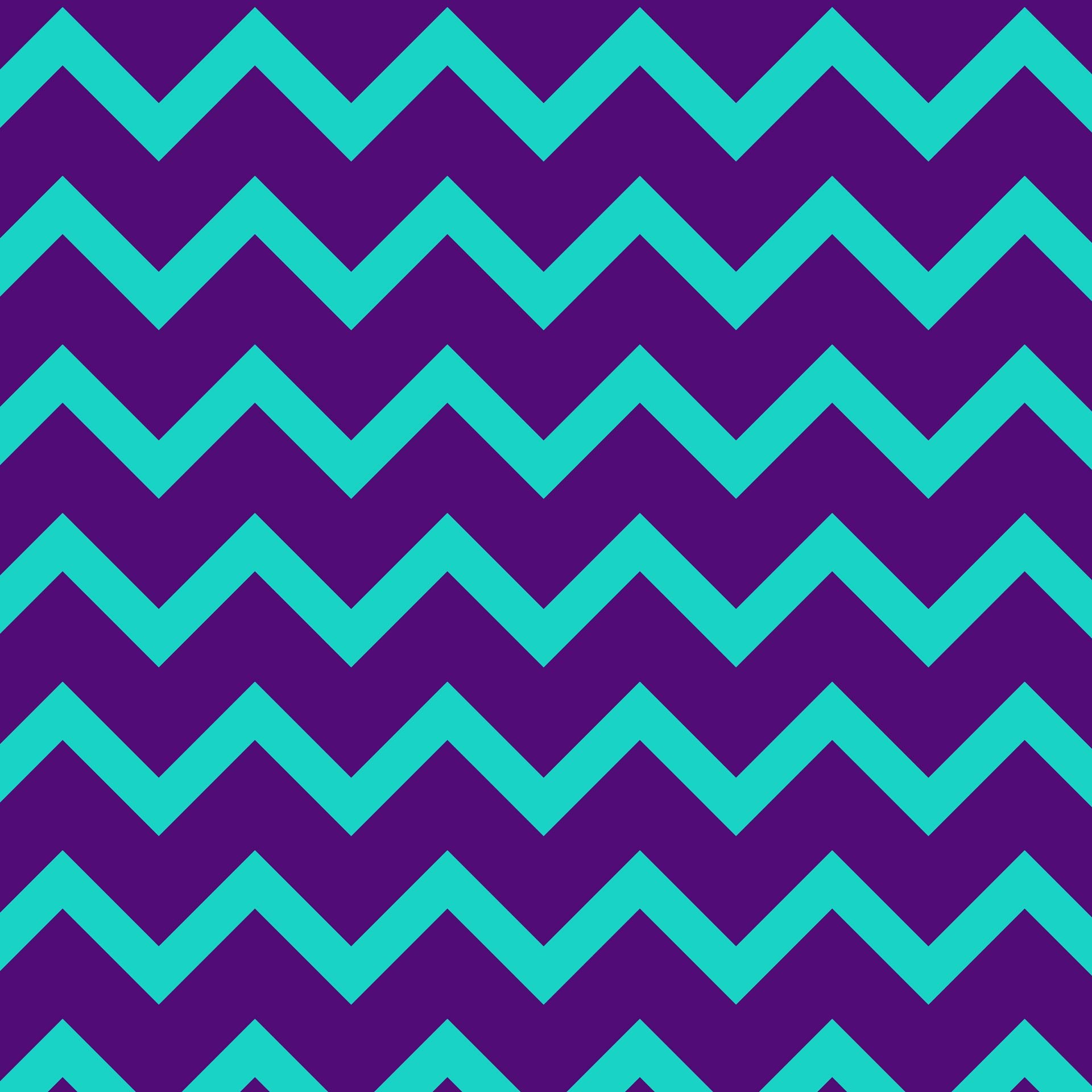

The Freaze logo perfectly embodies the brand visually; big, bold and fun, whilst communicating the unique process of freeze-drying sweets. Taking our brand font, Rubik, we’ve expanded and transformed each letter to replicate our product. This visual and design choice perfectly aligns with our brand ethos: taking the ordinary and making it extraordinary.
Whilst each letter stands solid and strong by itself, the logo as a whole has been crafted to sit together effortlessly, just like how our freeze-dried goodies sit tantalisingly on top of one another inside our packaging, just waiting to be ravaged by a hungry customer.


In today’s fast-paced world, there’s a growing need for moments of pure, unadulterated joy. People are constantly seeking ways to break free from the mundane and inject a bit of fun into their daily lives. They want excitement, whimsy, and a crunch-tastic burst of bold flavours to brighten up their everyday. And guess what? Freaze can deliver!
Everybody knows that life is a rollercoaster, and Freaze is here to make sure every loop, twist, and turn is filled with laughter, love, and ludicrously delicious freeze-dried sweets. Get ready to go wild, crazy, stupid, and happy with Freaze!


NEED OUR HELP?
Whether it's Branding, Design, Websites, Photography, Video, Print or Social Media, we can help you make an impact.