
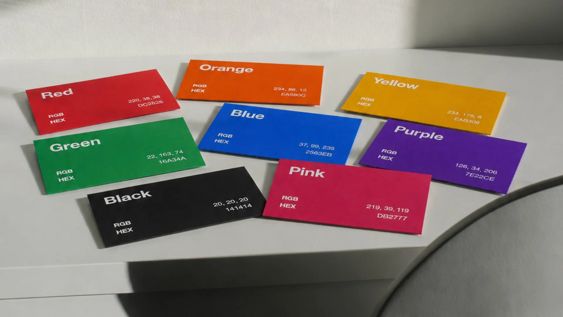
Choosing a brand colour because it’s your favourite might feel like a good place to start.
But colour does more than make your brand look nice.
Before someone reads your website, speaks to your team or understands what you do, colour can already be helping them form an opinion about your business.
It can make a brand feel confident, friendly, premium, energetic, trustworthy or creative.
That’s why colour should be a decision, not just a decoration.
What Different Colours Can Communicate
There are no absolute rules with colour. Context, typography, photography and the rest of your branding all play a part.
But different colours do tend to carry certain associations.
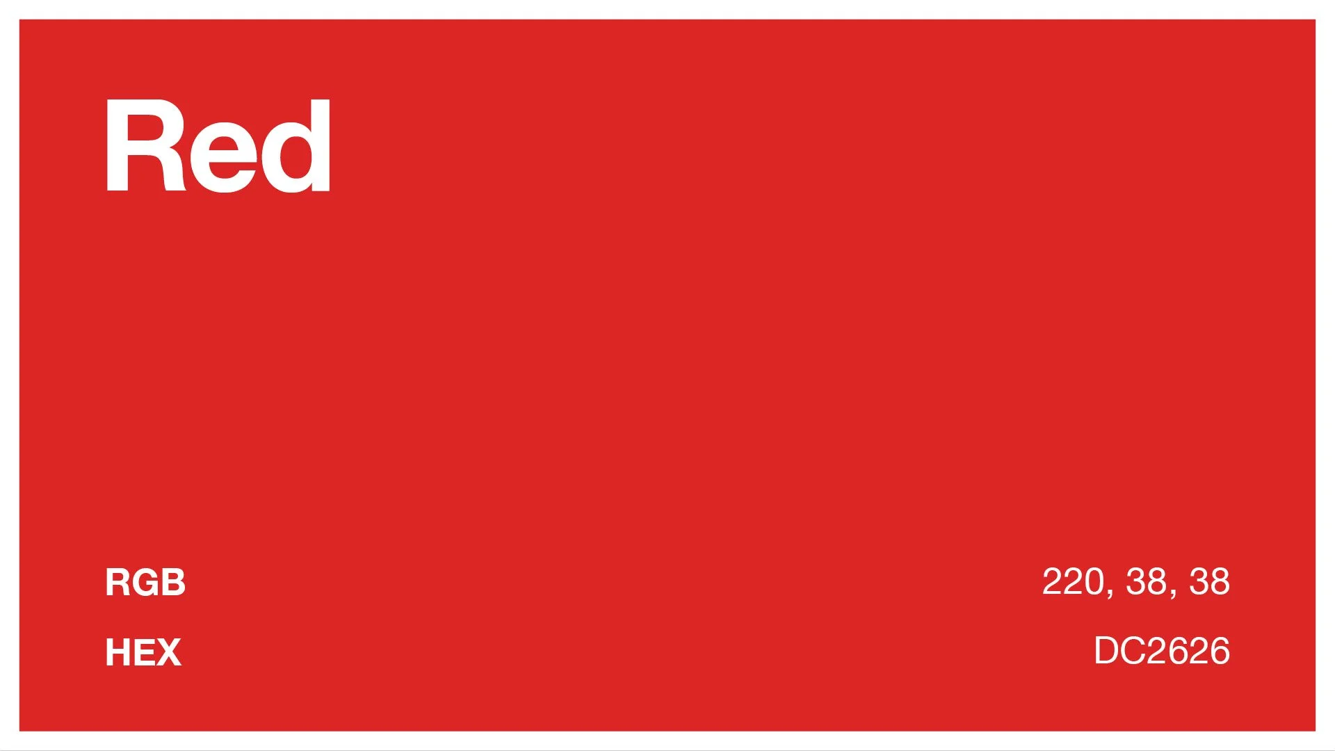
Red
Energy. Confidence. Excitement.
Red grabs attention quickly, which is why it’s often used by brands that want to feel bold, energetic or fast-moving.
Used badly, though, it can also feel aggressive or overly sales-focused.
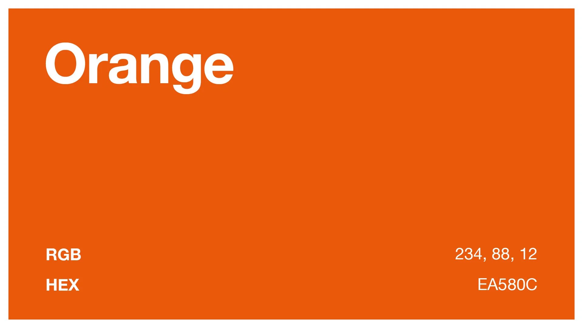
Orange
Friendly. Energetic. Approachable.
Orange can make a brand feel warm, positive and less corporate.
It works well for businesses that want to appear accessible and full of personality, but it can be harder to make feel traditionally luxurious.
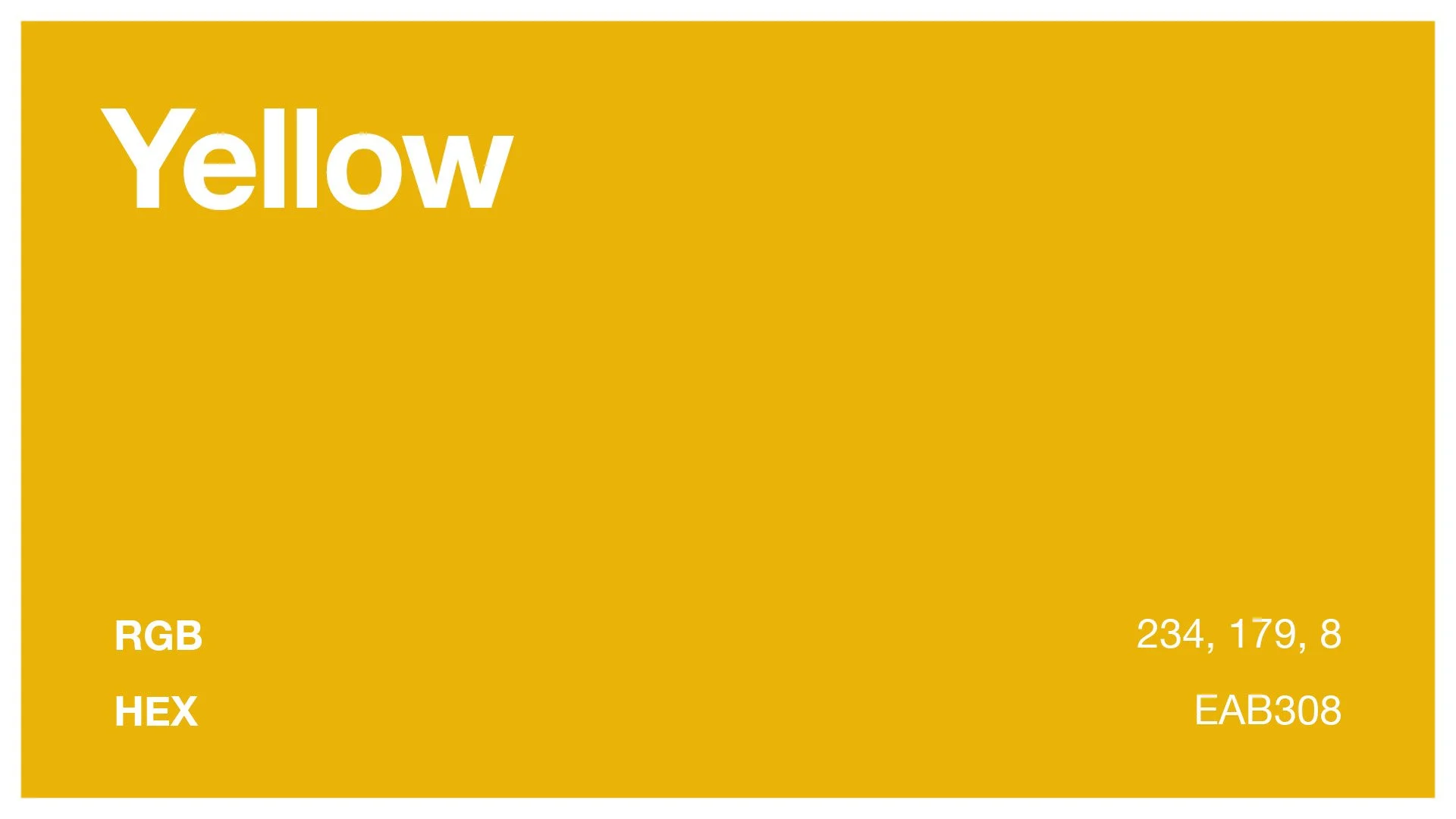
Yellow
Optimism. Warmth. Positivity.
Yellow naturally attracts attention and can make a brand feel cheerful and upbeat.
Too much of it, however, can become overwhelming, so it often works well as an accent colour rather than the main event.
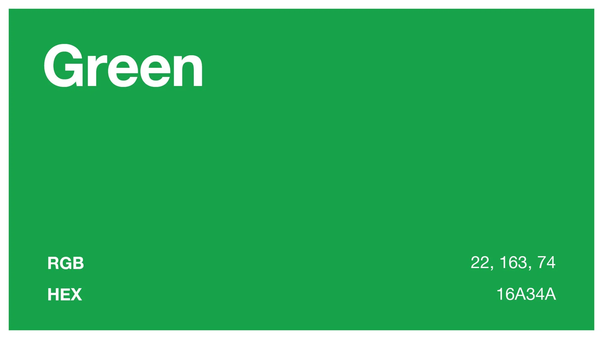
Green
Growth. Health. Nature. Calm.
Green is heavily associated with nature, wellbeing, sustainability and growth.
That can make it a natural choice for certain industries, but it also means it’s worth checking whether every competitor around you is already using it.
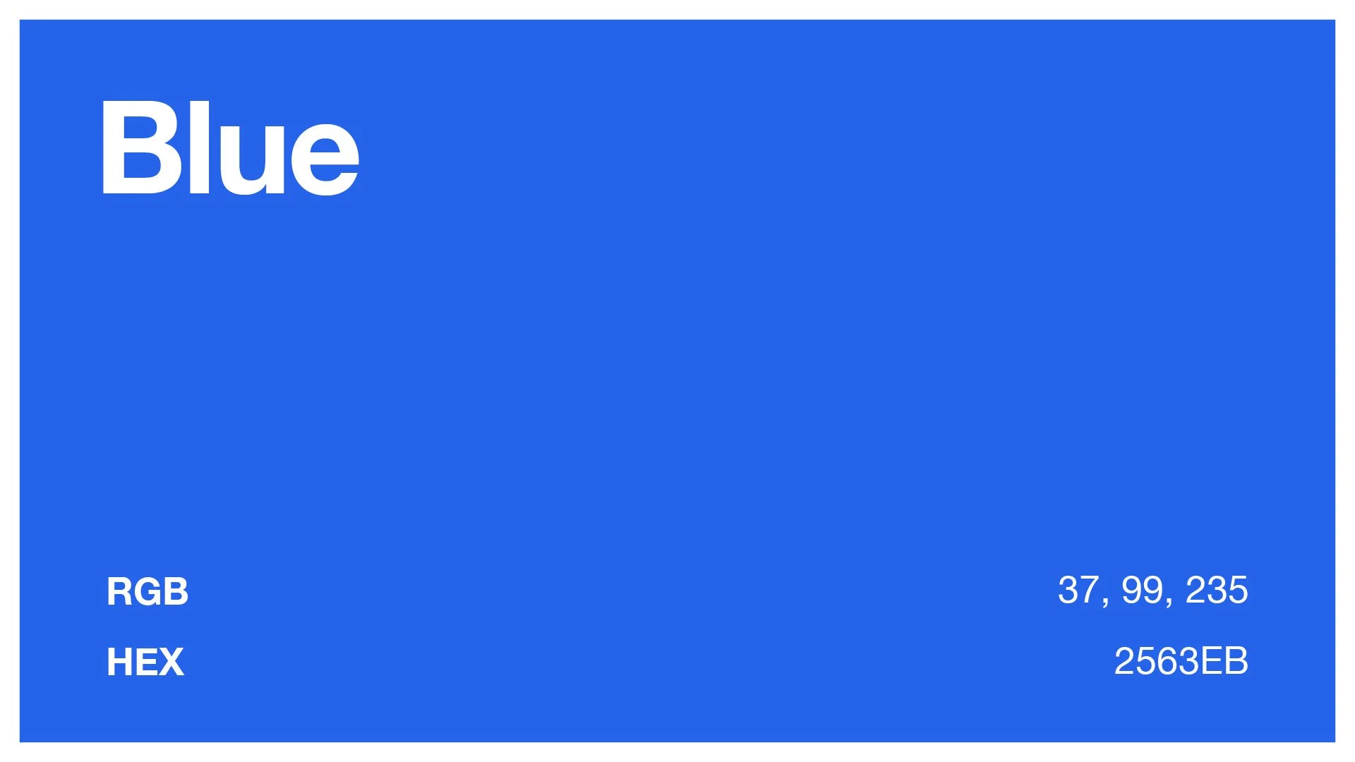
Blue
Trust. Stability. Professionalism.
There’s a reason blue appears so often in finance, technology and professional services.
It can help a business feel established, dependable and secure.
The downside? It’s incredibly common, so simply choosing blue doesn’t automatically make you memorable.
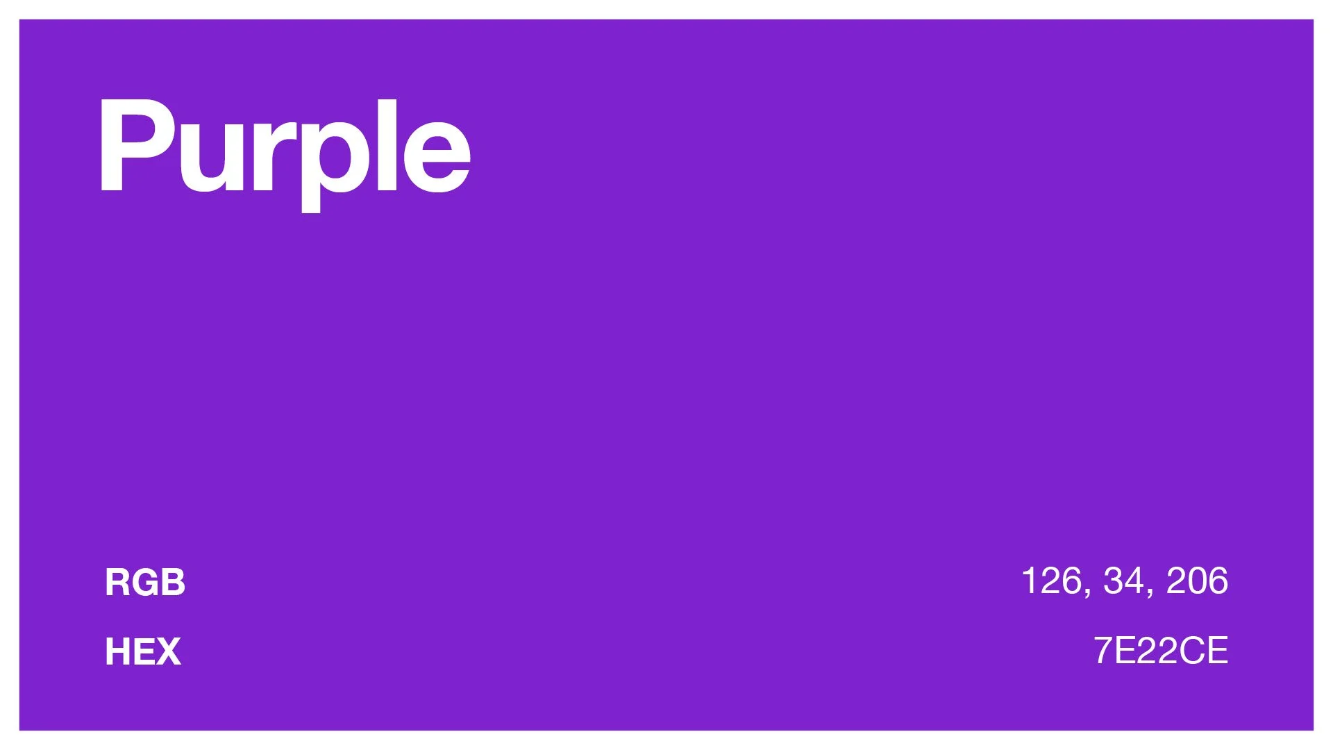
Purple
Creativity. Individuality. Luxury.
Purple can feel imaginative, distinctive and premium.
Depending on the shade and how it’s used, it can move from playful and creative to sophisticated and luxurious.
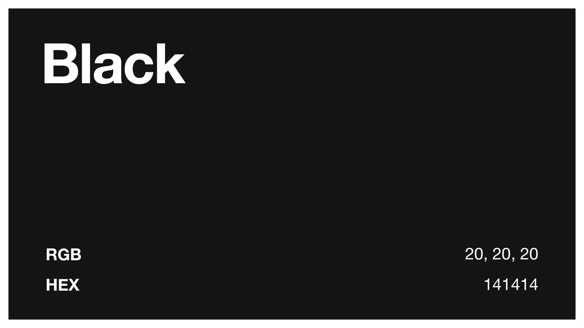
Black
Authority. Sophistication. Confidence.
Black can create a strong, premium and confident identity.
Combined with clean typography and plenty of space, it can feel luxurious. Pair it with harder imagery and bold type and it can feel completely different.
And that brings us to an important point.
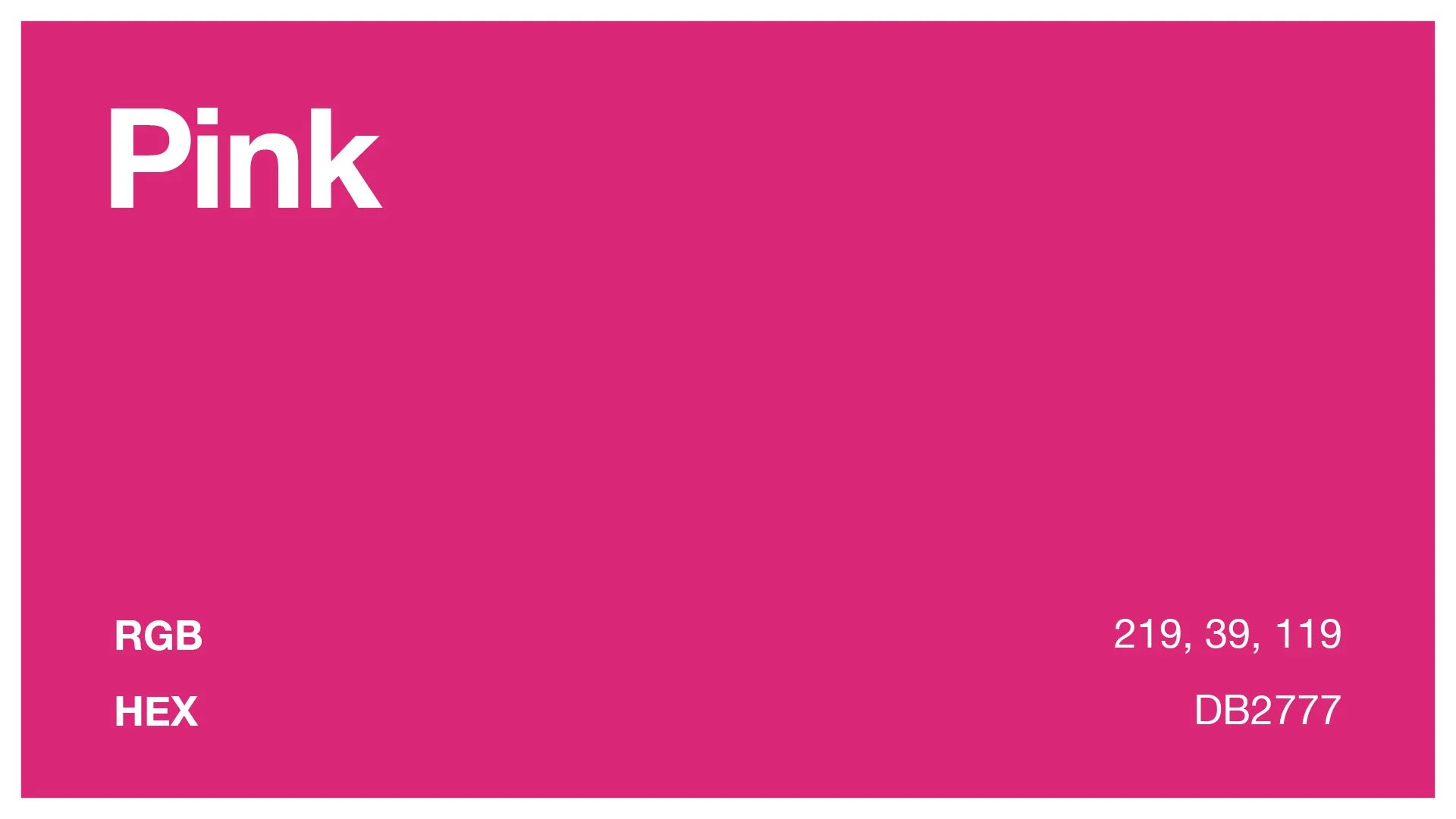
Pink
Warmth. Playfulness. Personality.
Pink can make a brand feel friendly, expressive and approachable. Depending on the shade, it can range from soft and calming to bold and energetic.
Used well, it can help a brand feel distinctive and full of character.
Colour Doesn't Work Alone
A colour doesn’t have one fixed meaning.
Black can make one brand feel luxurious and another feel rebellious.
Blue can make one company feel trustworthy and another feel cold and corporate.
The typography, imagery, layout, messaging and tone surrounding the colour all change the way it is perceived.
Your colour palette is only one part of the bigger brand.
Look at Your Competition Too
Before choosing a colour, look at what everyone else in your industry is doing.
If every business in your sector uses the same navy blue, using navy might help you feel familiar and established.
But it might also make you look exactly like everybody else.
Sometimes fitting into a category makes sense.
Sometimes standing apart is the smarter move.
The important thing is making that choice intentionally.
So, How Should You Choose a Brand Colour?
Start with the brand, not the colour.
Ask yourself:
How do we want people to describe our business?
What do we want people to feel when they see us?
What does our industry already look like?
What colours support the personality we want to communicate?
Then build your visual identity around those answers.
Because the question shouldn’t really be:
“What colour do I like?”
It should be:
“What do we want people to think and feel about our brand?”
That’s where good branding starts.
Frequently Asked Questions About Brand Colours
What do different brand colours mean?
Different colours can create different associations. Blue can feel trustworthy and professional, red can feel energetic and confident, green is often linked with nature and wellbeing, while black can feel premium and sophisticated. The way a colour is used alongside typography, imagery and messaging also affects how it is perceived.
What is the best colour for a brand?
There is no single best colour for a brand. The right choice depends on your audience, your industry, your competitors and how you want people to feel about your business.
Does colour psychology really matter in branding?
Yes, but it shouldn't be treated as a strict set of rules. Colour can influence the first impression people form of a brand, but context and the wider visual identity are just as important.
How do I choose the right colour for my business?
Start by deciding how you want people to describe your brand. Then consider which colours support those qualities, what your competitors are using and whether your chosen colour helps you fit into — or stand out from — your market.
Should my brand use the same colours as my competitors?
Not necessarily. Using familiar colours can help customers quickly understand what kind of business you are, but copying the look of your competitors can also make your brand harder to remember. The important thing is making the choice intentionally.
How many colours should a brand have?
Most brands work best with a small, consistent palette rather than lots of competing colours. A primary colour supported by a few secondary and neutral colours is usually enough to create variety while keeping the brand recognisable.
Is choosing a brand colour just about personal preference?
No. You can absolutely like the colours you use, but personal taste shouldn't be the only reason for choosing them. A strong brand colour should support the impression you want your business to make on the people you want to reach.
NEED OUR HELP?
Whether it's Branding, Design, Websites, Photography, Video, Print or Social Media, we can help you make an impact.