
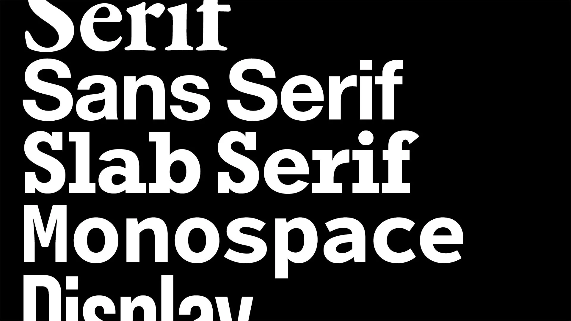
Fonts do much more than make words readable. They influence how your business feels, whether that’s established, modern, approachable, premium, technical or playful.
Choosing the right font isn’t simply about finding one you like. It’s about choosing typography that supports the personality of your brand and the impression you want to make.
Here are eight common font styles and what they can communicate.
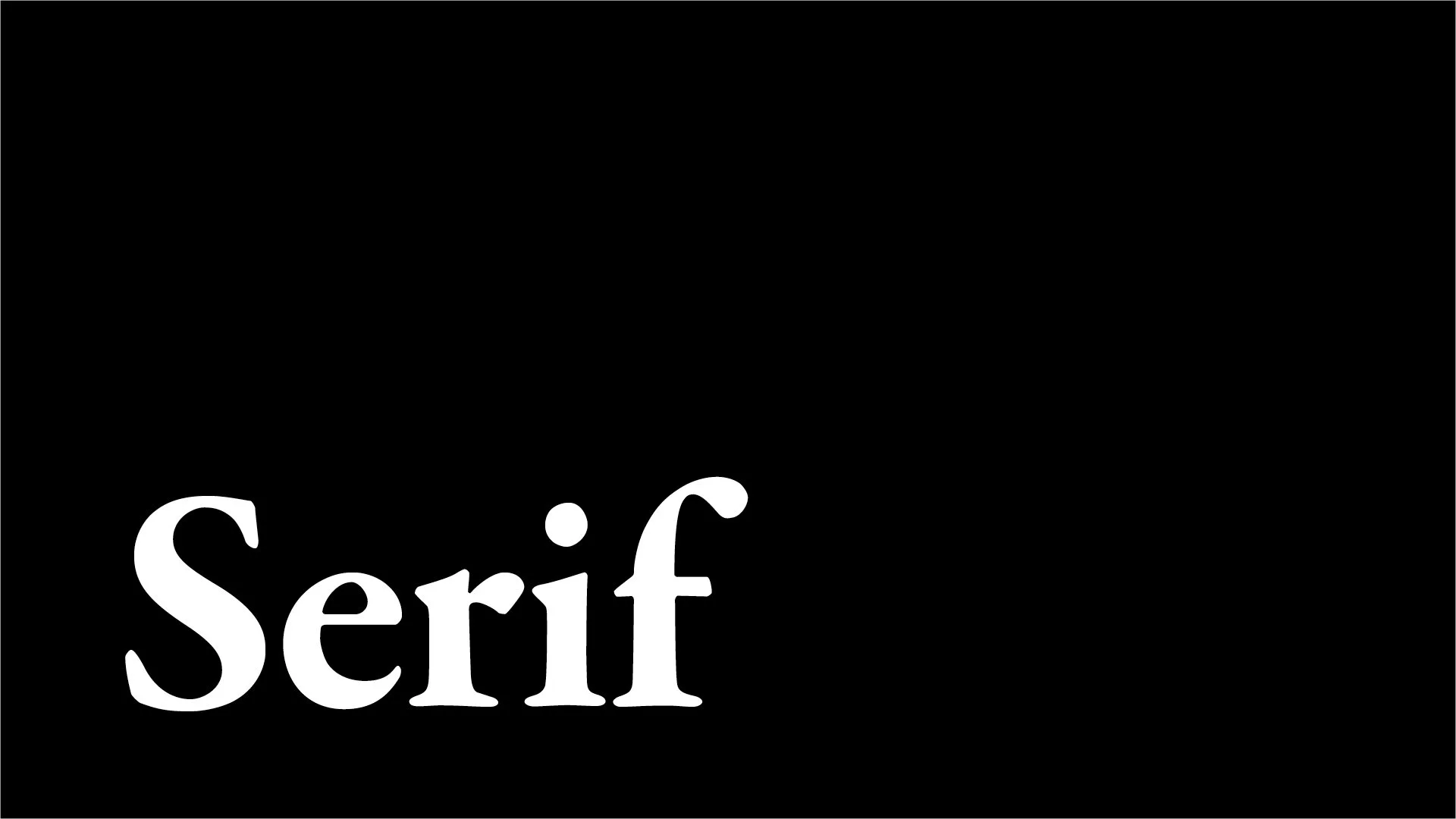
Serif
Established. Refined. Trustworthy.
Serif fonts feature small strokes at the ends of letters, giving them a more traditional and established appearance.
They can work particularly well for luxury brands, financial businesses, law firms, publishing and heritage brands where credibility and sophistication matter.
Think: experience, authority and refinement.
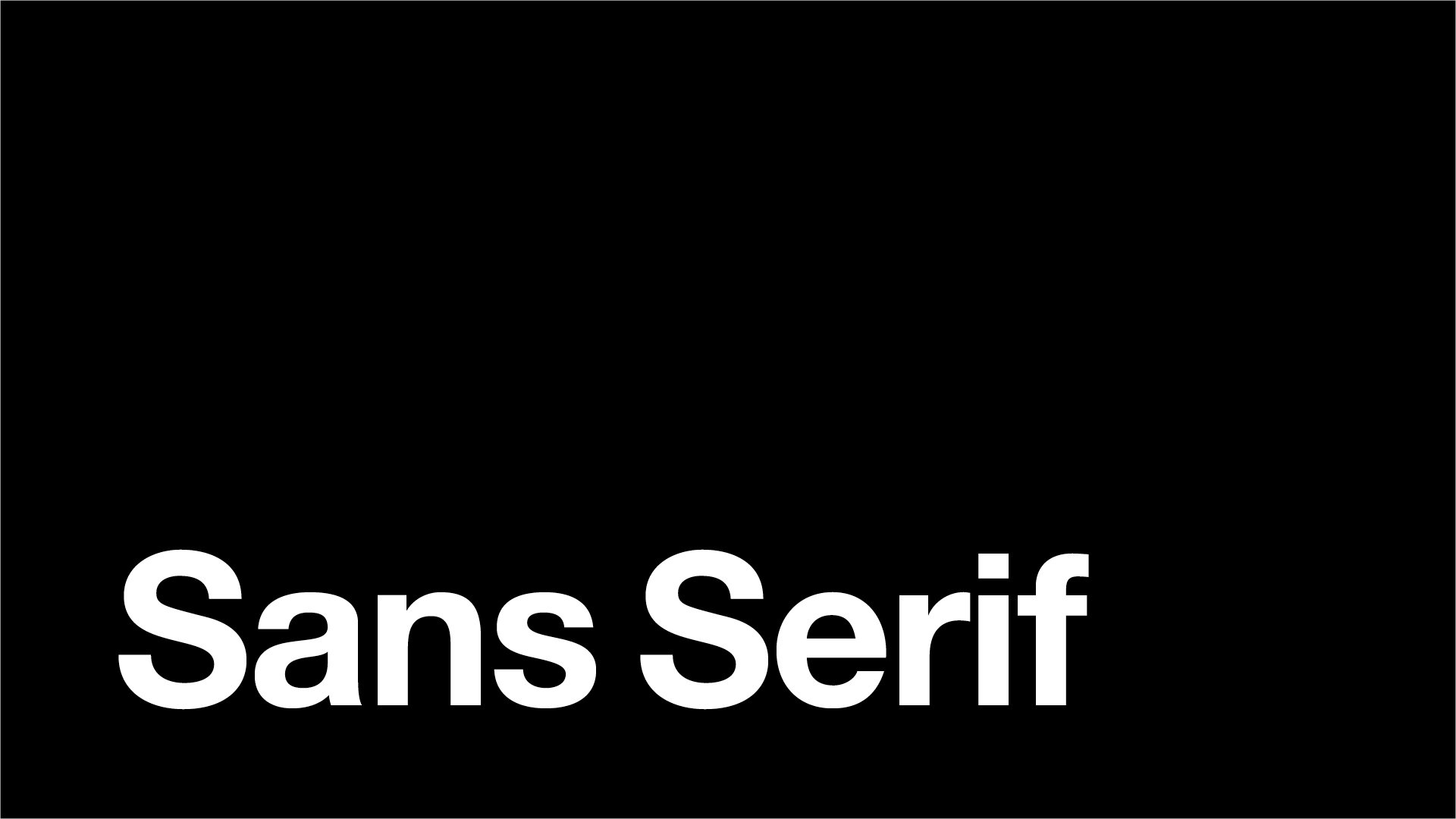
Sans Serif
Clean. Modern. Straightforward.
Sans serif fonts remove those decorative strokes, creating a cleaner and more contemporary appearance.
Their simplicity makes them incredibly versatile and popular across technology, healthcare, professional services and modern consumer brands.
Think: clarity, confidence and simplicity.
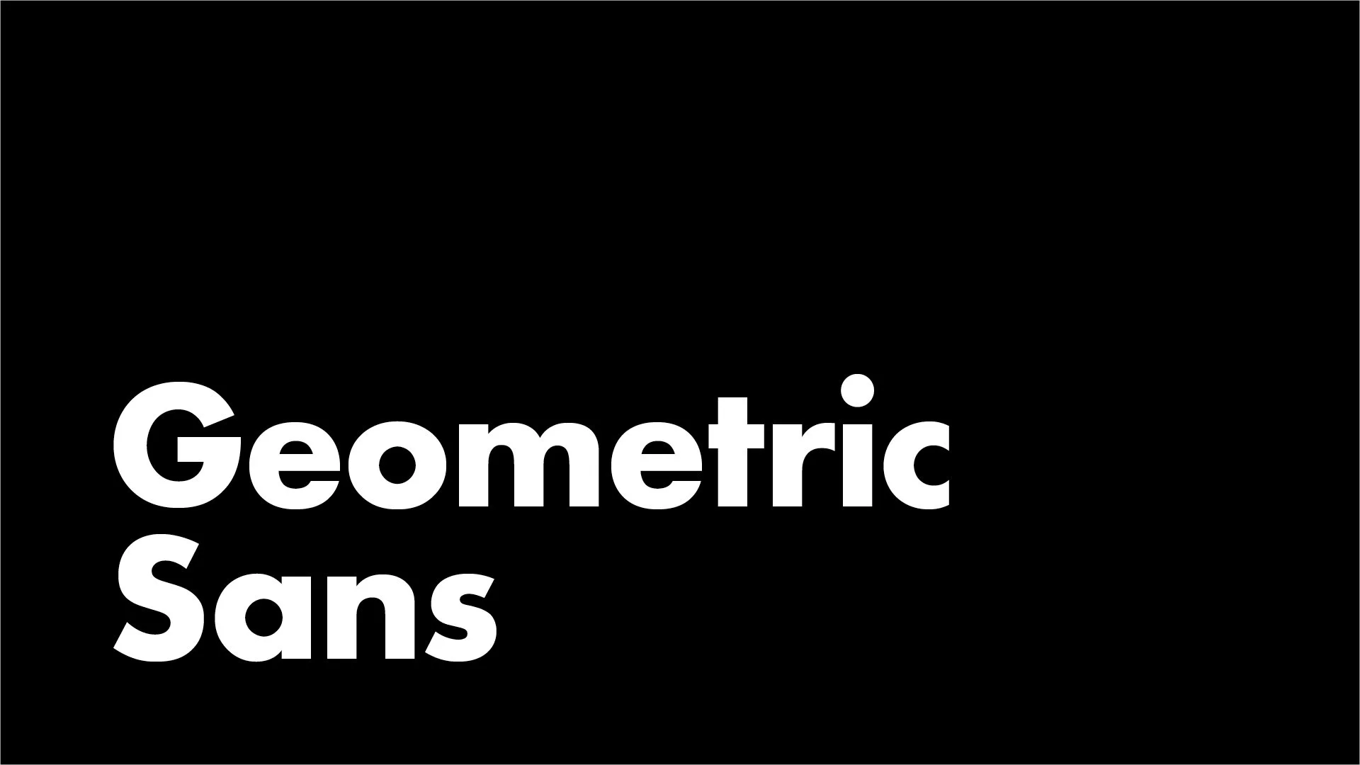
Geometric Sans
Precise. Progressive. Structured.
Geometric fonts are built around simple shapes such as circles and straight lines, creating a highly considered and ordered appearance.
They’re often a good fit for architecture, property, technology, design and brands that want to appear progressive and contemporary.
Think: modern thinking and precision.
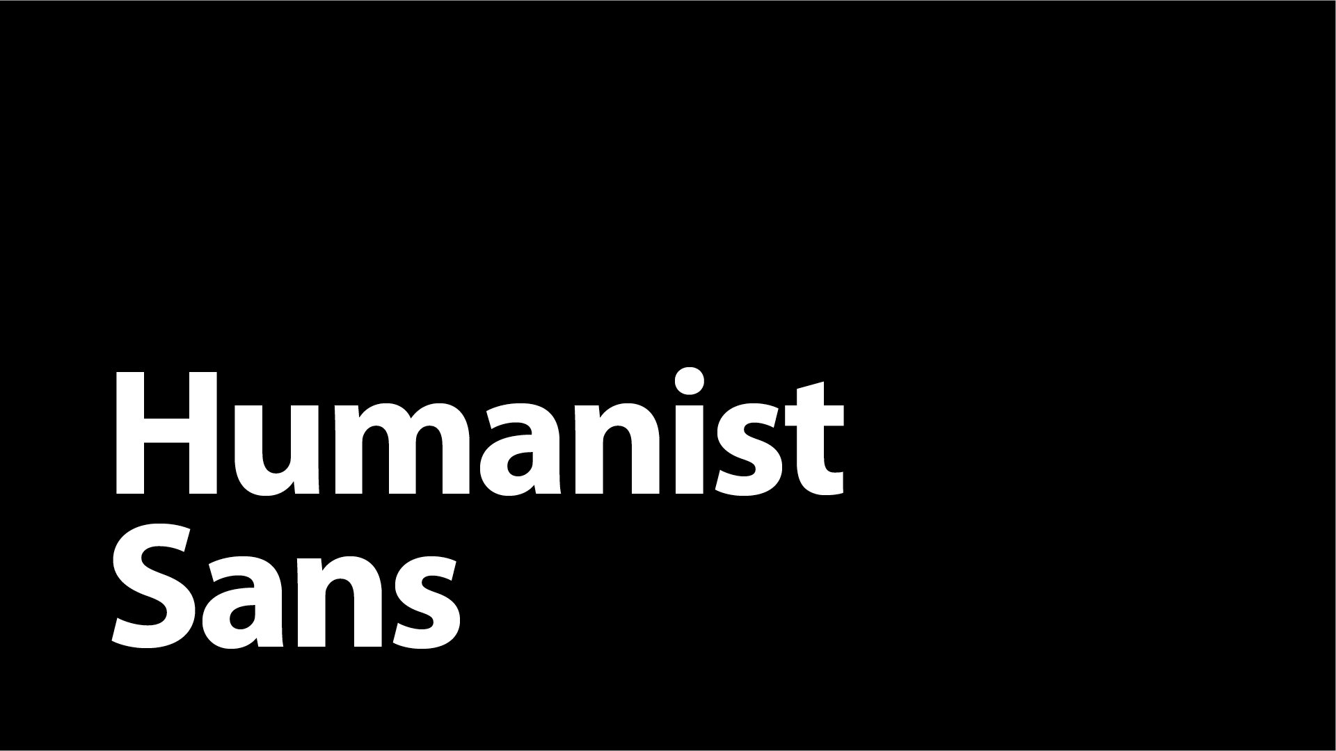
Humanist Sans
Warm. Approachable. Human.
Humanist sans serif fonts have softer, more natural letterforms inspired by traditional handwriting.
They retain the clarity of a modern sans serif while feeling less clinical or corporate, making them particularly effective for healthcare, education, wellness and people-focused businesses.
Think: professional without feeling impersonal.
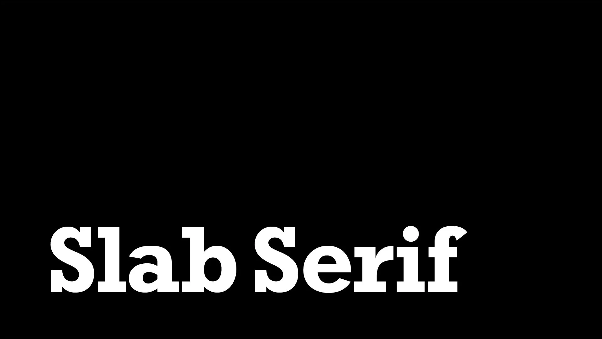
Slab Serif
Bold. Dependable. Characterful.
Slab serif fonts feature much heavier, block-like serifs, giving typography a strong and confident personality.
They can work particularly well for food brands, trades, automotive businesses, sports brands and businesses looking for a sense of strength or heritage.
Think: solid, dependable and built to last.
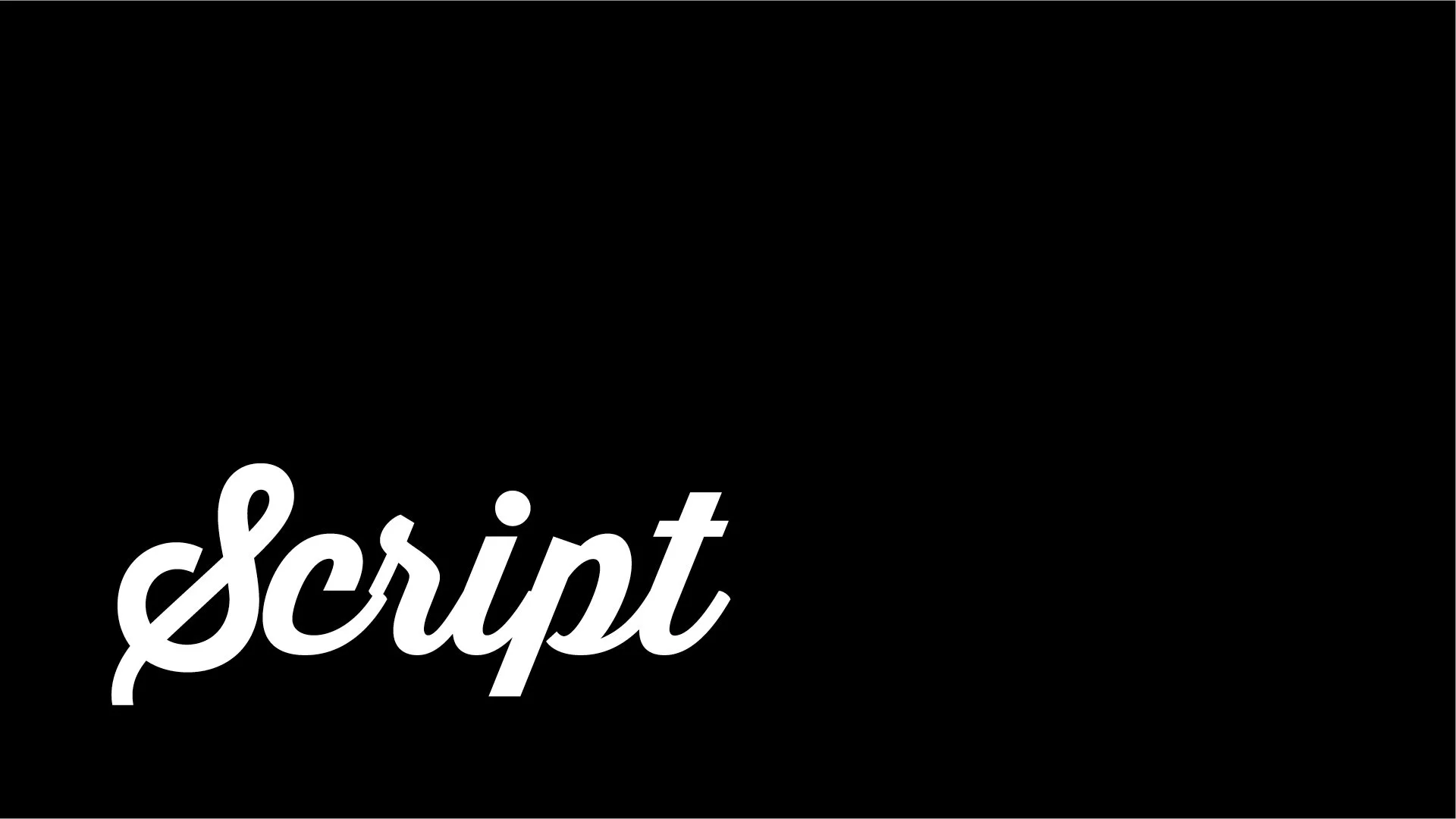
Script
Personal. Elegant. Expressive.
Script fonts take inspiration from handwriting and calligraphy, creating a much more individual and crafted feel.
They’re often used within beauty, hospitality, fashion and artisan brands where personality and a personal touch are important.
They should be used carefully, though. A beautiful font isn’t much use if your customers struggle to read it.
Think: personal, crafted and expressive.

Display
Distinctive. Creative. Attention-grabbing.
Display fonts are designed to stand out.
They often have much stronger personalities than everyday typefaces, making them useful for logos, headlines, packaging and campaigns.
They’re particularly suited to entertainment, fashion, food and drink and challenger brands that want to be remembered.
Think: impact and individuality.
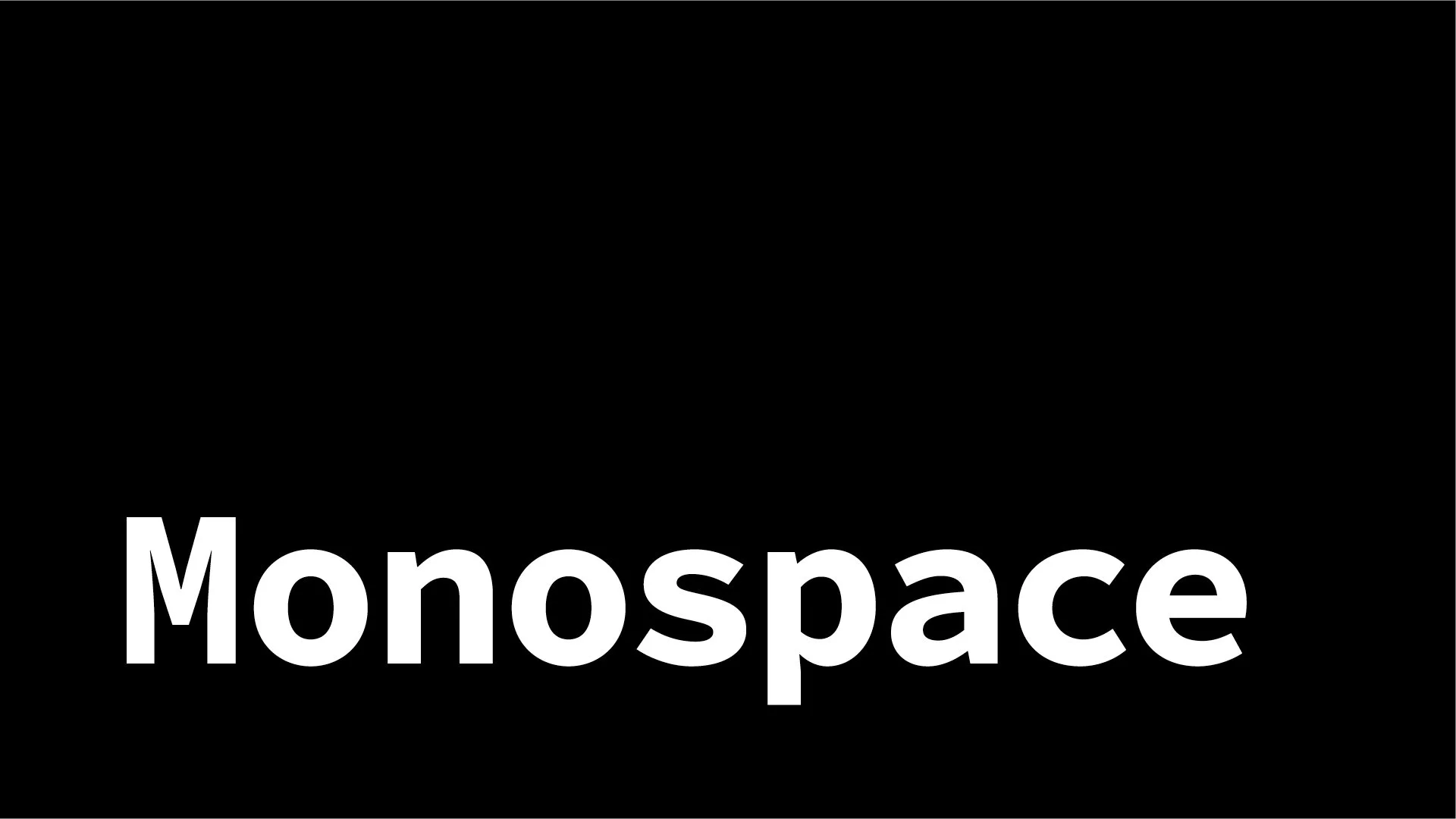
Monospace
Technical. Systematic. Unconventional.
In a monospace font, every character takes up exactly the same amount of horizontal space.
Originally associated with typewriters and computer coding, they can give a brand a technical, digital or engineered personality.
They’re particularly relevant for technology, software, engineering and more experimental brands.
Think: systems, technology and precision.
So, Which Font Is Best for Your Business?
There isn’t one font style that every business in a particular industry should use.
A financial business doesn’t have to use a serif. A technology company doesn’t have to use a geometric sans serif. And a luxury brand doesn’t automatically need an elegant script.
The better question is:
How do you want people to perceive your business?
Your typography should reinforce that answer.
A business wanting to appear established and authoritative may choose very different typography from one wanting to feel disruptive, friendly or highly innovative, even if they operate within the same industry.
It's Not Just About Choosing a Font
Typography is about much more than selecting one typeface.
Font weights, sizing, spacing, capitalisation, hierarchy and the way different fonts work together all contribute to the overall personality of your brand.
Two businesses could use exactly the same font and still create completely different impressions depending on how they use it.
That’s why good brand typography should be treated as a system rather than simply a font choice.
Should Your Brand Use More Than One Font?
Often, yes, but you don’t need many.
Using two complementary typefaces can create contrast while keeping your brand consistent.
For example:
Serif + Sans Serif can balance tradition with modernity.
Display + Sans Serif can combine personality with readability.
Script + Sans Serif can add a personal touch without sacrificing clarity.
The important thing is that each font has a purpose.
Can You Use Any Font for Your Business?
Not necessarily.
Fonts are licensed products, and different licences can cover different uses including logos, websites, apps, packaging and marketing materials.
Before using a font commercially, always check that your licence allows the way you intend to use it.
Your Font Says More Than You Think
People may never consciously identify the font your business uses, but they will experience the feeling it creates.
The right typography can help your brand feel more credible, distinctive and appropriate for the audience you're trying to reach.
Because choosing a font shouldn't simply be about what looks nice.
It should be about what feels right for your brand.
Frequently Asked Questions About Brand Fonts
What is the best font for a business?
There is no single font that works for every business. The best choice depends on how you want your brand to be perceived.
Serif fonts can feel established and refined, while sans serif fonts often feel modern and straightforward. Script fonts can add personality, and display fonts can help a brand feel more distinctive.
The right font should reflect your brand’s personality, appeal to your target audience and remain clear across every application.
What fonts look the most professional?
Professional fonts are usually clear, well-balanced and easy to read.
Serif fonts are often associated with experience, authority and trust, while clean sans serif fonts can make a business feel modern, capable and confident.
Professionalism does not come from one particular font style. It comes from choosing appropriate typography and using it consistently.
What fonts make a brand look expensive?
High-contrast serif fonts, refined sans serifs and carefully used script fonts can all help a brand feel more premium.
However, the font alone will not make a brand look expensive. Spacing, layout, colour, imagery, print quality and the overall visual identity all contribute to a luxury impression.
Premium branding usually relies on restraint, consistency and attention to detail rather than overly decorative typography.
Are serif or sans serif fonts better for branding?
Neither is automatically better.
Serif fonts can communicate heritage, credibility and sophistication. Sans serif fonts often feel cleaner, more modern and more accessible.
The better option depends on your brand personality, audience and positioning. Some brands also combine the two to create contrast between headlines and supporting copy.
What font should I use for my logo?
Your logo font should reflect the personality of your business while remaining distinctive and recognisable.
A luxury brand might use an elegant serif. A technology company may choose a geometric sans serif. A creative or hospitality brand might use a more expressive display or script style.
However, a logo should not rely on an unmodified typeface alone. Customisation, spacing and composition can help create something more ownable.
Should my logo font and website font be the same?
Not necessarily.
Your logo may use a more distinctive or expressive typeface, while your website needs fonts that remain easy to read across headings, menus, buttons and longer paragraphs.
The fonts do not need to be identical, but they should feel like they belong to the same brand.
How many fonts should a brand use?
Most brands only need one or two primary typefaces.
One font may be used for headlines and another for body copy, creating contrast while keeping the identity consistent. Some brands use different weights from the same font family instead.
Using too many fonts can make communications feel inconsistent and difficult to recognise.
Can different font styles be combined?
Yes, provided the fonts have clearly defined roles and complement one another.
Popular combinations include:
Serif headlines with sans serif body copy
Display typography with a simple sans serif
Script accents with a clean supporting font
Two contrasting weights from one font family
The strongest font pairings create contrast without appearing disconnected.
What is the easiest font style to read?
Simple serif and sans serif fonts are generally the easiest to read, particularly when used for longer paragraphs.
Readability also depends on the font size, weight, spacing, line length and contrast with the background.
Script, display and decorative fonts are usually better reserved for short headlines or small accents rather than body copy.
Can the wrong font damage a brand?
Yes. Typography can create an impression that conflicts with what the business is trying to communicate.
A playful font may undermine a serious professional service. An overly formal serif might make a friendly modern brand feel dated. A complicated script may make important information difficult to read.
The wrong font can make a business feel less credible, less relevant or less consistent.
Can I use any font commercially?
No. Fonts are licensed products, and the licence determines how they can be used.
A font may be free for personal use but require a commercial licence for logos, websites, packaging, advertising or social media content.
Always check the licence before using a font within your brand. Adobe Fonts and other professional font libraries provide licensing information for their available typefaces.
What is the difference between a font and a typeface?
A typeface is the overall design family, such as Helvetica or Garamond.
A font traditionally refers to a specific variation within that family, such as Helvetica Bold or Garamond Italic.
The terms are often used interchangeably in everyday conversation, but typeface describes the wider design while font describes a particular style or weight.
How do I choose the right font for my brand?
Start by defining how you want your business to feel.
Consider whether your brand should appear:
Established or progressive
Premium or accessible
Serious or playful
Technical or human
Minimal or expressive
Then choose typography that reinforces those qualities, works across every touchpoint and remains clear for your audience.
The best brand font is not simply the one you like most. It is the one that communicates the right message consistently.
NEED OUR HELP?
Whether it's Branding, Design, Websites, Photography, Video, Print or Social Media, we can help you make an impact.